


I've created a number of startup brands over the years, and they all need branding. Logo creation isn't hard if you're not picky and don't mind a tiny bit of effort.
These tips are mostly just for early stage startups, bootstrapped founders, and anyone who can't afford a designer. If your business is already making enough money to afford a designer, do it. Good design is definitely something to focus on once you've already achieved product-market fit.
But for the rest of us who are just getting our brand off the ground and aren't designers, read on...
Tools
Figma
Figma is an amazing alternative to Adobe XD or Sketch. It's easy to use and completely free.
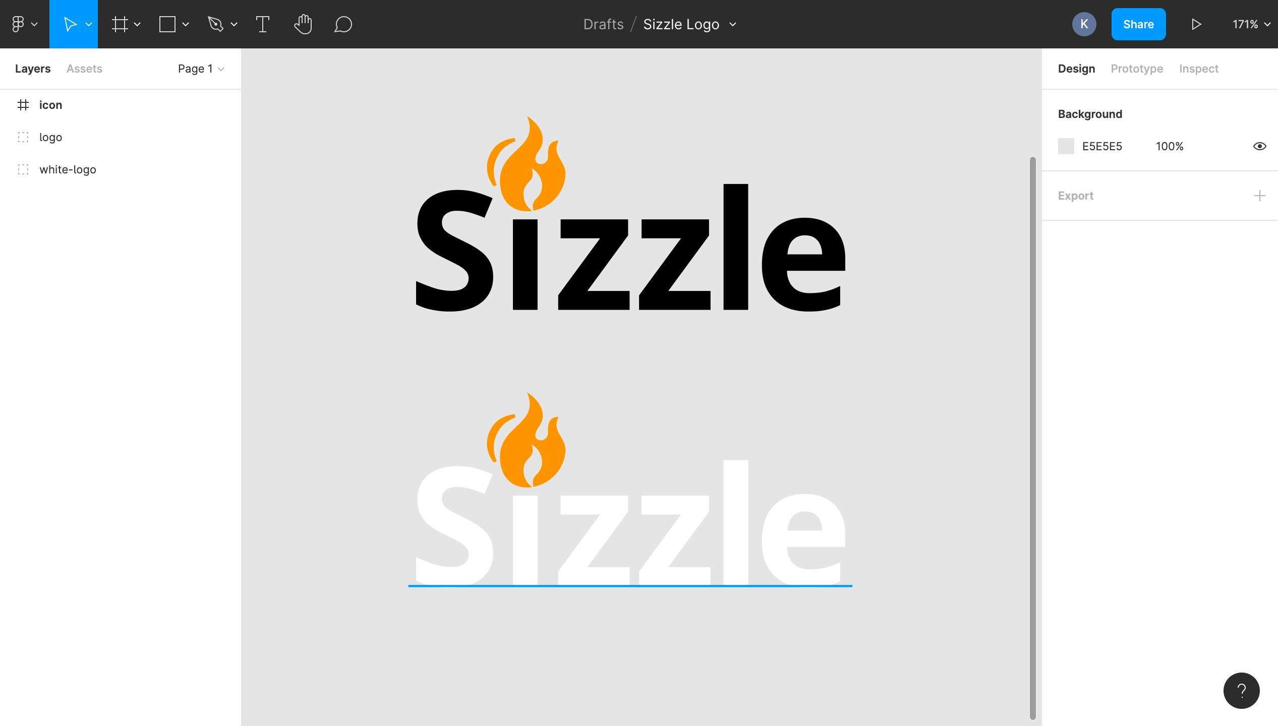
I usually build my logos in Figma, and export them out as SVG when I use them for websites. It's also a great collaboration tool since it's web-based and easy to share projects with other users.
Icons
Many people make the mistake of starting with clip art for their logo. Clip art usually has too many colors, doesn't size down well, and often just looks terrible. Start with an icon instead. They're much simpler, resize well, and are easier to edit.
If you've got experience with vector illustrations, you can illustrate your own. But I usually download icons for free and alter them in Figma. For a quick startup logo, it still looks pretty professional if you keep it simple.
If you download icons for your logo, make sure to download SVGs and not PNGs. PNGs look fuzzy when you resize them above their natural dimensions and have a much larger file size.
Make sure you always check the license before you download an image to use for your logo. Many websites will let you download their images, but their license requires you to link back to their site or prohibits you from using the image for commercial purposes entirely. UXWing is a great resource for icons that are free for commercial use without attribution. Start there and move to Google if you can't find something that works for your logo.
Research
Don't create your logos in a vacuum. Look at competitor logos and imagine yours on a list next to theirs. Does it stand out?
Do research on your target audience as well. What other kinds of brands do they like? If possible, create a poll or survey to ask your target audience directly what they think about your logo options.
Tips
- Simple logos are harder to screw up, look great in a variety of different use cases, and usually stand the test of time better than more complex logos.
- Only use 1 color, and pair it with black or white.
- Only use 1 font. If you need variety, use one other weight of the font.
- Don't do all capitol letters if your brand's name is two words combined into 1. Proper capitalization can help users pronounce the name at a glance. Example: "DesignSync" is much easier to read at a glance than "DESIGNSYNC".
- You should be able to blur your eyes and still read the words and identify any imagery.
- Adjust the spacing between letters (this is called "kerning"). Go with what looks natural and feels easiest to read.
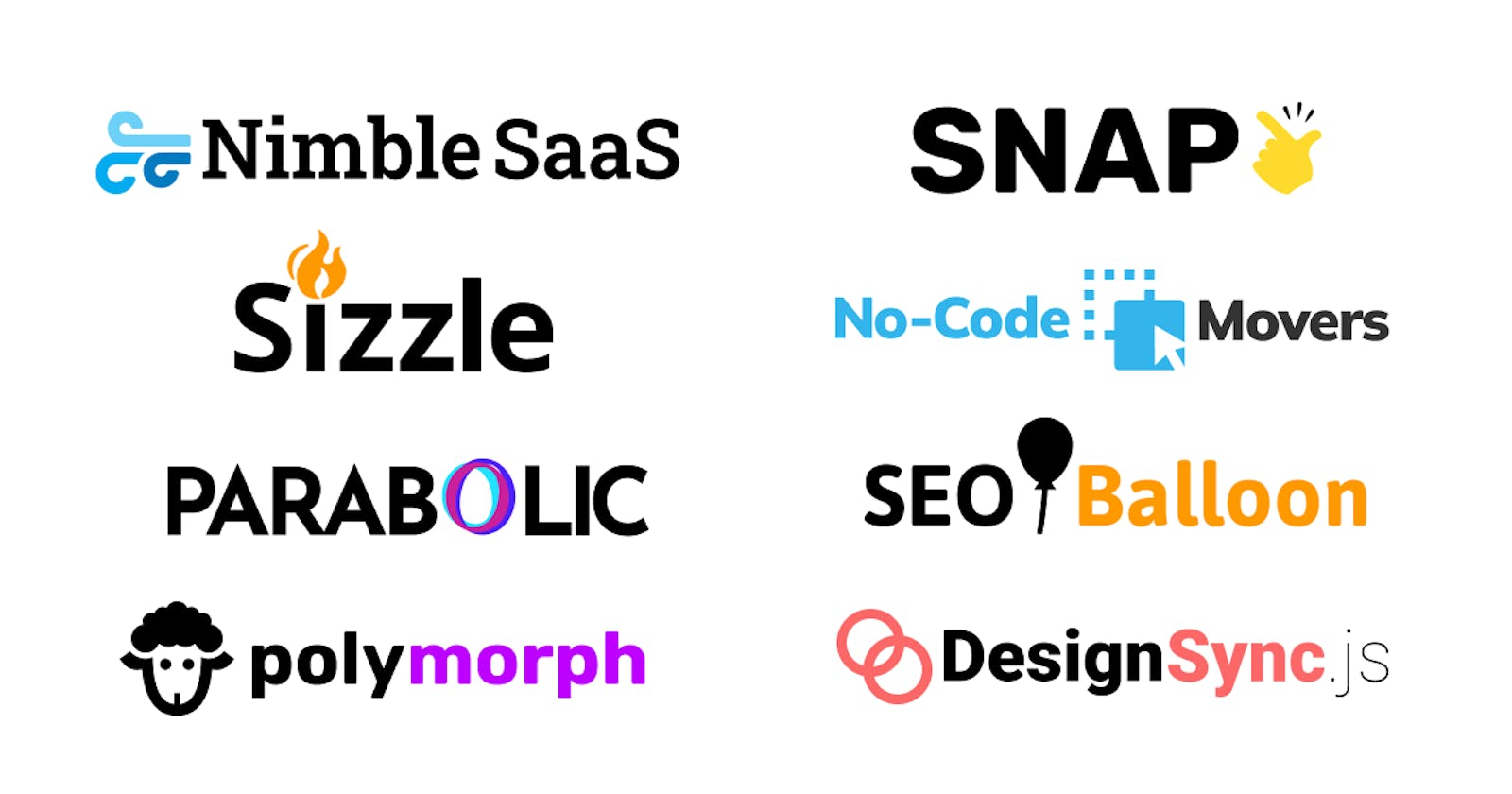
Logos I've made using this method
You can see a few of the logos I've created in the cover image at the top of this article. Nothing revolutionary, but they were all free and none of them took longer than 3 hours or so.